10. Aleksandra Dugic, Emily Cannon, Mostafa Rahman from 283goswell on Vimeo.
Showing posts with label Aleksandra Dugic. Show all posts
Showing posts with label Aleksandra Dugic. Show all posts
Friday, 24 May 2013
Friday, 1 February 2013
Thursday, 31 January 2013
Evaluation: Question four
From our visit to Screen on the Green I have learnt several interesting things from gaining feedback from fellow students after the viewing. Nearly everyone asked pointed out that the smoking was obviously seen as rebellious and cool thing to do but felt that in my music video the artist smokes too much. In my opinion, I agree because in nearly every shot the artist is either smoking a cigarette or has one in her hand which takes away from the cigarette being seen a symbol of cool as can become slightly repetitive and therefore boring.
This is something that I would definitely improve on as I have noticed what this aswell. However, the fact that the cigarette is symbolic of this is good as that the in the brand image we wanted to create for our artist, however if I could improve, I would make the cigarette a prop and not such a big part of the music video as it can draw attention away from the artist herself.
Below are some videos of audience feedback I recorded that stood out to me the most as nearly all exactly say that the smoking is too much and voice their own view on the matter.
People also commented on my use of base track, most mentioned was for the chorus, they liked how the camera and editing matched the beat and pace of the song, along with the artists movement e.g. miming gunshots. They said that it made the music video overall more entertaining a the artist was putttng on a performance and being energetic which made it more enjoyable for the viewers.
Sunday, 27 January 2013
Tuesday, 22 January 2013
Thursday, 17 January 2013
Planning Ancillary products: Completed Advertisement mockup

This is my completed advertisement mockup for my artists brand new album 'Tell it like it is'. I decided to use a new image for my advertisement but still stick with the reoccuring theme of rayban sunglasses as I did for my digipak and the actual music video, as well as the artists image and style. The font and colour of the writing is white and exactly the same as the font used for the digipak, this is because too many different colours would not have looked good with my digipak so I stuck to white colours and decided to do the same for my advertisement; it looks more simple and professional that way. As with many poster and magazine advertisements, the artists twitter, facebook and official website are promoted. The writing is short and simple so that way it is memorable; if the audience are intrigued by the advertisement and artist there is information available for where they can find out more about the artist and their music on their website and social media. There is also two small reviews by professional and well known music brands that review the artists album and give it stars out of five.
The writing and additional logo pictures all blend around the image of the artist Aleks. that way it does not draw attention away from the actual artist but is still eye catching and readable.
There is also a large image of what the actual album looks like; this subconsciously lets the audience remember what the album looks like when they go buy it on itunes or in stores.
Thursday, 10 January 2013
Planning Ancillary products: Inspiration from excisting Ancillary products
An acillary product that mainly inspired my digipak is Katy B's album 'On a mission' and the music video for her song 'Lights On'. The reason why is because her album cover is almost exactly the same as the outfit, hairstyle and makeup are all the same except her tanktop is a different colour. Also, in that scene of her music video the same colour scheme that is used for her album is used in the music video; colours like purple and blue as they are used in the special effects of the lighting.

The reason I took inspiration from this digipak is because I planned on using some pictures taken from filming that is used in the music video. When we filmed at Kings Cross and Angel I plan to use those pictures for my digipak so it would act as a still shot of one of the scenes from the music video. I wanted my digipak to reflect my music video and not have it contrast by using different colour schemes and types of outfits for my digipak so I stuck to similar things.

This outfit is similar to the one used in the digipak

Along with hair

Makeup and accessory choice

The pose is similar to the one on the digipak cover
Planning Ancillary products: Short list of fonts, colours, layout and design ideas

- Raja Drama
- Meiryo
- Sierra Madre
- Gulim
- Lucida Grande
In the end I have decided that the font I am going to use for my digipak will be Raja Drama. This font will be used consistently throughout my digipak, mostly for the artists name and the albums name. However, for the special thanks and spine I am going to use smaller, clearer writing so that the small print can be read but the two fonts will be consistent with each other.
Colours I considered using in my digipak are:
- White
- Black
Also, for my colour scheme I have decided to keep it fairly simple and in the end decided just to use the colour white for my writing as the pictures that are going to be used in my digipak are already quite strong and colourful so any bright colour such as red or yellow would not stand out against the pictures so I have opted to use white as it is a neutral colour that will not contrast with my pictures.
The layout of my digipak will be of a 2 panel CD digipak. The first two panels will act as the front and the other two as the back cover as I wanted to have a fairly simple CD design.

I am going to be using pictures that we had taken when we were filming and also grab some screenshots of the artist from the music video as the shots were very clear, in focus and have great potential for use in the digipak. My design is going to be sticking to 3 particular outfits the artist wore in the music video that all compliment each other and would not contrast too harshly if I was to use them in my digipak. These pictures will be from our days of filming at Kings Cross, Angel, Camden and Banksy Tunnel.
Tuesday, 8 January 2013
Planning Ancillary products: Completed final mockup of Digipak


This is my completed mock up of my digipak for the artist 'ALEKS'. I took into account Mary's previous feedback and put the artists name and album name on the spine and added in the record label and companies logo on the back of the digipak, along with the small print that is typically found on the back cover of a CD. This has made my CD overall look a lot more professional and realistic just by adding in the small touches that Mary recommended. The inside of the digipak I have decided to keep simple, there is an image of the artist and then the CD panel is darker but opaque so you can see an image of the artist where the CD would go. Overall, I am pleased with the overall outcome of my digipak.
Thursday, 20 December 2012
Planning Ancillary products: Marys feedback on Digipak Mockup
My teacher Mary had a look at my Digipak mockup and she likes the concept so far. She likes the font and that I have followed the conventions of having the artist name be bigger than the albums name, and that the colour of the writing is continuous in my digipak.
Mary also liked the images that I used; they stayed with the theme and did not contrast from one another but worked well and created a continuous theme for the digipak. Also, Mary likes the camera shot type that I chose for the album cover which is a picture of the artist at a mid close up of the artists face. Also, the track listing writing is propped against the wall of the image which Mary found very effective.
The only thing Mary suggests is that on the spine I need a record label logo and the artists name.
Audience Feedback on Music Video
On Tuesday 18th December, we went to go watch our music videos on the big screen; at the cinema called Screen on the Green. After the showing was finished I went out and got some feedback from A2 media students about what they thought of my music video:
Tuesday, 18 December 2012


Sunday, 16 December 2012
Planning Ancillary products: Photos considered for use in Digipak and Advertisement
There are two different solid styles that I have being considering for my digipak and advertisement:

The first style I considered is very bright and loud in the sense that there is a lot of colour and attitude in the pictures which I feel would reflect upon our artists personality and genre very well. However, I felt that it may be difficult to do in the digipak as it would be hard finding a font and colour that is not overwhelmed or underwhelmed by all the different colours; which also do not match the 3 colour scheme typical of a digipak. The above images I picked out of a dozen as I feel they were the best; I particularly like the image of just the background without the artist in it as it would be a good picture to use for the tracklist panel on the back.

The second style I considered is very natural and bright. which would make working with a two colour scheme very easy as there is a variety of colour to choose from to match the images but the images are not too flashy and bright that they will overwhelm the font and colour. I had several other images that i would have preferred to use over these but they will be caught of the actual music video as I am looking for many close ups of the artist in this costume attire.
The first style I considered is very bright and loud in the sense that there is a lot of colour and attitude in the pictures which I feel would reflect upon our artists personality and genre very well. However, I felt that it may be difficult to do in the digipak as it would be hard finding a font and colour that is not overwhelmed or underwhelmed by all the different colours; which also do not match the 3 colour scheme typical of a digipak. The above images I picked out of a dozen as I feel they were the best; I particularly like the image of just the background without the artist in it as it would be a good picture to use for the tracklist panel on the back.
The second style I considered is very natural and bright. which would make working with a two colour scheme very easy as there is a variety of colour to choose from to match the images but the images are not too flashy and bright that they will overwhelm the font and colour. I had several other images that i would have preferred to use over these but they will be caught of the actual music video as I am looking for many close ups of the artist in this costume attire.

Thursday, 13 December 2012
Researching Ancillary products: Analysis of three magazine advertisements
To get a better idea of how digipaks are advertised I have looked at three different CD advertisements in two different magazines to get a better idea as you cannot find a good CD magazine advertisement online as it will only direct you to media students work so I have taken the liberty of looking through magazines to get a better idea.
In the KERRANG magazine I found:
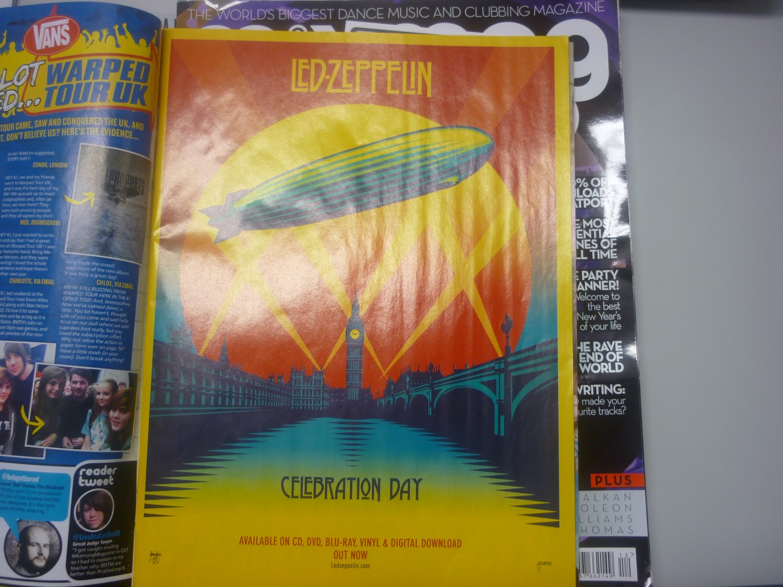
LED ZEPPELIN - CELEBRATION DAY
The chosen colours would all contrast normally but here they have being made to blend together really well, creating this impressive image of the Big Ben and the River Thames. The font is simple and the text simply says the name of the album. This advertisement is my favourite as the simplicity of it makes it more effective and stand out.

RICHARD HOWLEY - STANDING OF THE SKYS EDGE
The advertisement for the CD is very simple; it has an image of the artist standing in an above camera shot with an impressive sky behind him. The font of the writing is the same, as is the colour, which is white. Below the advertisement is an image of what the album looks like.

NEIL YOUNG WITH CRAZY HORSE - PSYCHEDELIC PILL
This advertisement is quite irregular as it does not have an image of the artist or band as it usually would. Instead, it has the actual image of the album blown up to fill the page. It is very simple and the sticks to the usual 3 colour maximum rule that you would see with CD's; all of the writing is black and the fonts are the same except for the date the album is going to be released.
This advertisement is quite irregular as it does not have an image of the artist or band as it usually would. Instead, it has the actual image of the album blown up to fill the page. It is very simple and the sticks to the usual 3 colour maximum rule that you would see with CD's; all of the writing is black and the fonts are the same except for the date the album is going to be released.
Saturday, 8 December 2012
Examining previous Ancillary work

Here is a GIF of the worksheet we filled in when we analyesd previous students ancillary work. We looked at advertisements and digipaks; from the good to the bad. The three I analysed were by the artists 'Poppy Power', 'Indiya' and 'Y Shocker'.
Researching Ancillary products: Introduction of Digipaks
What is a digipak:
A digipak is a modern approach to CD packaging that is usually made of cardboard, it is used to provide the target audience with a lot more information about the artist to give them some kind of insight into their lives making a stronger connection between the artist and the audience, this is really important because you need to let the audience know that you care about them otherwise they will not feel the need to but the artists album.
What should a digipak look like:
it is important that we use a minimum of 4 panels when creating our digipak because it is important that we have enough room to get all of the information that we can on all of the different panels, the front cover is the most important because we need to inform the audience of who our new artist is, the artist name is also really important because if the audience don't know the name of the artist then it will be impossible fr them to buy the album.
What should be included in the digipak:
- Name of artist
- Name of album
- Track listings for the album
- Production information (Copyright and Company details)
- A few thank yous
- Collage of the artist during filming
- Snippets of lyrics from the song
- Behind the scene information
Subscribe to:
Posts (Atom)